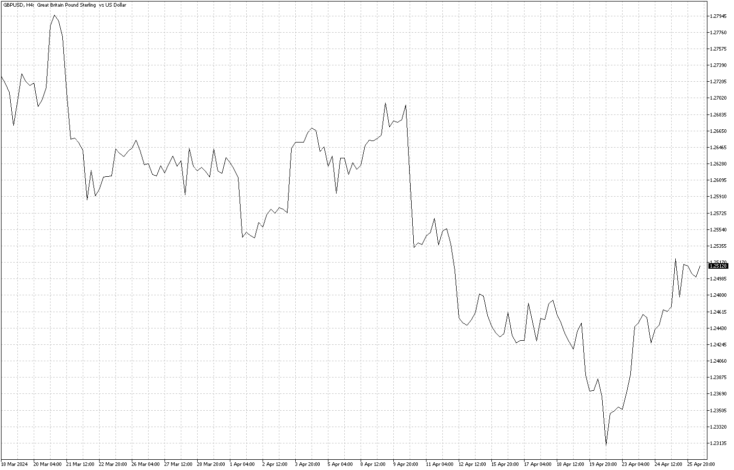
FxNews – Forex Line charts are like stories that numbers tell us. They turn data, or information, into pictures that help us understand what’s going on. We use lines and dots to see changes over days, months, years, or even seconds. This guide will easily explain line charts. We’ll discuss why Forex line charts are helpful, where they can be used, and how to make good ones. We’ll also show some examples to make things clear.
Understanding Forex Line Chart

A line chart is a drawing that shows information as dots connected by lines. Imagine drawing dots on a page to show how hot each day of the month is. Then, you connect these dots with lines. Now you can see if the month was getting hotter or cooler as days passed. The place where you draw the dots side by side is called the x-axis, usually showing time, like hours or days. The place where you draw dots up and down is called the y-axis, showing what you measure, like temperature or money.
Why Line Charts Are Helpful
A. Easy to See Changes: Forex Line charts are great because they make it easy to see if things are going up or down over time. This helps us see if something is improving, like if a person’s running speed is getting faster each day.
B. Helping Us Choose: Line charts are essential in helping people decide what to do. For example, a toy company might look at a line chart of how many monthly toys they sell. If sales go up in June because of a holiday, they might decide to make more toys before that month.
C. Comparing Things: Line charts let us examine more than one thing at a time. For example, you could have a chart showing the number of sunny, rainy, and cloudy days each month. This would help you compare and see which weather is most common.
Where We Use Line Charts:
A. Money Matters: Line charts are often used by investors who work with money, like in banks or the stock market. They help show how prices change over time. For example, a line chart can show if the cost of apples increases during winter because there are fewer apples.
B. Health Checks: Doctors use line charts to track people’s health. For instance, a line chart can show if a person’s heart rate goes up or down while they exercise.
C. Economy Watching: People who study the country’s money and jobs, called economists, use line charts. They might make a chart to show how many people have jobs each month or how much things cost at the store.
Tips for Making a Good Line Chart

A. Keep It Simple: Don’t make a chart too busy by adding too much. If you have a lot to show, using more charts or a different kind is better.
B. Be Accurate: Make sure your dots are in the right places. If they’re not, the lines will be wrong, and people might make bad choices.
C. Label Clearly: Write what each part of the chart stands for, like what each line represents if there’s more than one, and what the numbers on the sides are for.
D. Show the Dots: It’s essential to draw the dots where the lines bend or change because that’s where the accurate information is.
E. Make It Relevant: Only show what’s essential for your explanation. For example, if you’re showing how many pets a store sold, you don’t need to include what the pets ate that day.
F. Fit Screens: If you’re showing your chart on a phone or computer, make sure it can adjust to fit well on all screens.
Conclusion
Line charts help us see stories that numbers tell. They can show us if things are getting better or worse, help us make decisions, and let us compare different things. We can find forex line charts in banks, hospitals, science labs, and sports fields. Good line charts are simple, accurate, straightforward, and show only what’s essential.
They’re like good friends who tell you things straight, helping you see what you need to know. So, next time you visit a line chart, you’ll know it has an important story to share!