FxNews – In Forex trading, long-wick candlesticks are essential for traders. They show market feelings and possible price changes. These patterns started with Japanese rice traders and are now significant in financial market analysis. A long wick candlestick stands out because its wick is much longer than its body. This shows that the market strongly rejects specific prices. It tells us about the push and pull in buying and selling. There are different kinds of long wick patterns, each meaning something special.
The ‘Hammer’ and ‘Shooting Star’ are standard in Forex. With a significantly lower wick, the Hammer points to a bullish change. It means buyers beat sellers by the end of trading. With a big upper wick, the Shooting Star hints at a bearish change, where sellers won buyers. These patterns are extra important after a long trend. They might show a shift in the market. However, traders should mix them with other analysis ways to check their hints and control risk well.
What Does Long Wick Candlestick Mean?
In trading, a candlestick has a body and maybe one or two wicks. The body shows the start and end prices. The wicks tell us the highest and lowest prices at that time. When a wick is long, the market doesn’t like the prices at its ends. A big upper wick means high prices didn’t stick, as they fell back near the start price.
If the wicks are long, the market is up and down. This means the high and low prices are far apart during that candlestick’s time.
- A big upper wick can be a bad sign, especially after prices increase. Buyers raised the price, but sellers took over and made it drop.
- A significantly lower wick is usually a good sign, especially after falling prices. It shows sellers lowered the price, but buyers rose strongly and raised it back up.
Upper Shadow
When a candlestick chart shows a long line above the main body, it tells us something important about the stock’s price. This long line, called an upper shadow, means the price increased for a while. But, by the end of the period, the price stayed low. It fell back down. This pattern hints that the market might be turning bearish so that prices could drop.
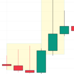
It’s like a story where buyers try hard to increase the price, but in the end, the sellers win. They bring the price down from its highest point during the day. This shows us the struggle between buyers wanting higher prices and sellers wanting lower ones. The longer the upper shadow, the more it shows sellers had the upper hand, pushing the price down significantly from its highest point.
Lower Shadow
Imagine looking at a chart and seeing a shape like a candle with a long, thin line stretching downwards. This shape is called a “candle” in trading. Now, think of this candle as having a long bottom part, like the handle of a hammer. This is important in understanding the stock market.
This long bottom part, or “lower shadow,” tells us something interesting. Many people started buying stocks when the prices were low. This buying spree could mean the market has hit its lowest point, the “market bottom.”
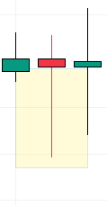
Here’s what happens in detail: During the trading day, the sellers are in charge for a while. They are selling their stocks, which causes the prices to fall significantly. This is why the candle’s lower shadow is long – it shows how far the prices dropped.
But there’s a twist. Before the trading day ends, the buyers step in. They start buying stocks like crazy because the prices are low. This buying pushes the prices back up. So, the prices have risen from their lowest point when the market closes.
This whole situation is like a battle between sellers and buyers. The sellers are winning at first, but then the buyers come in and turn things around. This switch can signify that the market might start going up again. It’s like a signal for traders to watch out for.
Different Kinds of Candlestick Patterns with Long Shadows
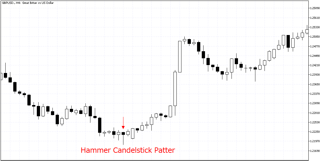
Hammer candlestick pattern: The hammer and the inverted hammer are patterns in stock charts. They’re interesting because they can tell you that the stock’s price might start going up.
Let’s start with the hammer. It looks like a hammer, which is where it gets its name. It has a long line at the bottom called a wick. This long lower wick is a clue that the stock’s price could begin to rise. The stock says, “I’ve fallen, but I’m getting ready to climb back up!”
Inverted Hammer candlestick pattern: Now, the inverted hammer is the opposite. It’s like a hammer turned upside down. This one has a long line at the top. Even though it’s upside down, it’s also telling us that the stock price might go up. It’s another sign that the stock, after dropping, might be gearing up for an increase. So, both the hammer and the inverted hammer are helpful for people who watch and analyze stock charts. They serve as hints, suggesting that a stock falling in price might be about to turn around and start climbing.
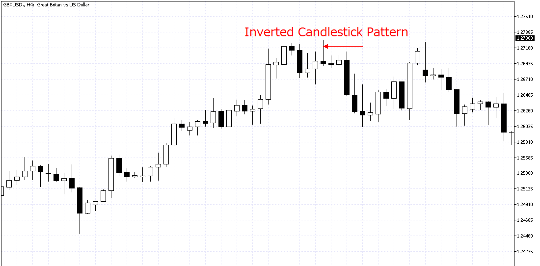
Shooting Star and Hanging Man
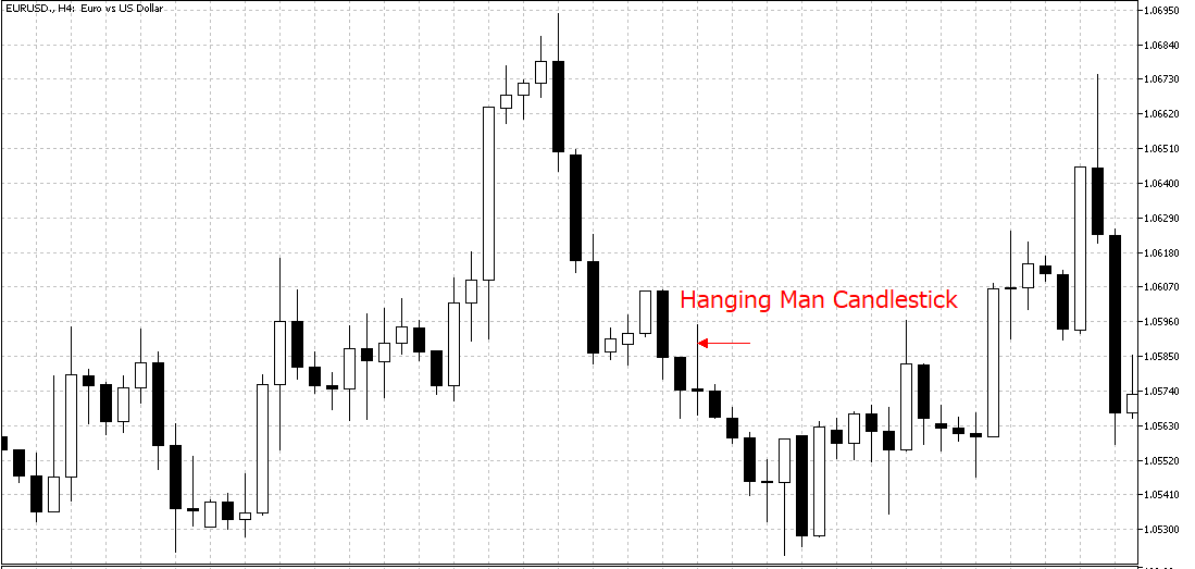
Shooting stars and hanging man describe specific patterns seen on price charts. Both these patterns have a unique shape. They have long lines on top, which traders call “upper wicks.” This shape looks like a candle’s flame or wick.
The shooting star pattern shows up during uptrends. An uptrend is when prices are going up. But when traders see a shooting star, they think it’s a warning. The uptrend might soon end, and prices could start falling. This is why it’s seen as a bearish sign predicting a price drop.
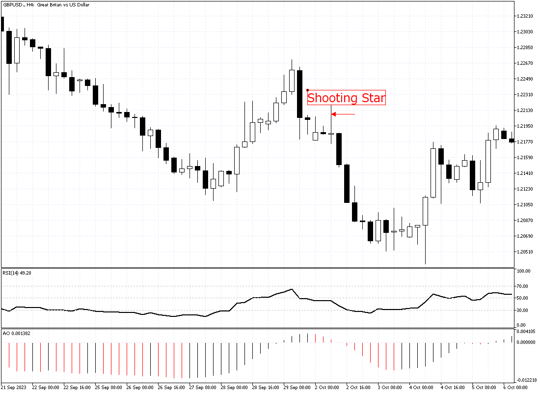
On the other hand, the hanging man pattern appears during downtrends. A downtrend is when prices are falling. The hanging man also gives a bearish signal. It implies that the downtrend will continue, leading to a further price decline.
Key Factors
Market Trend: When we look at the stock market, the way candlesticks appear can tell us a lot. If these wicks are long, they can mean different things based on what the market is doing.
Let’s talk about when the market is going down, which we call a ‘downtrend.’ Seeing a candlestick with a long wick at the bottom is essential in this situation. This long lower wick might hint that things are about to change – maybe the market will start going up. But, if the market isn’t clearly going up or down and is just moving sideways, this same kind of candlestick with a long lower wick isn’t as big of a deal. It doesn’t give us as strong a hint that the market might change direction.
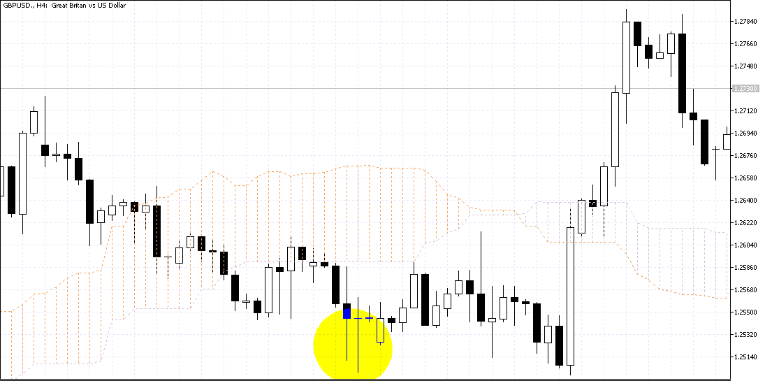
The image below shows the GBPUSD pair in the 4-hour time frame. Several Longwick candlestick patterns are seen on the chart. However, the market is ranging and doesn’t have a clear direction. The candlestick patterns cannot assist in our technical analysis if the market moves sideways.
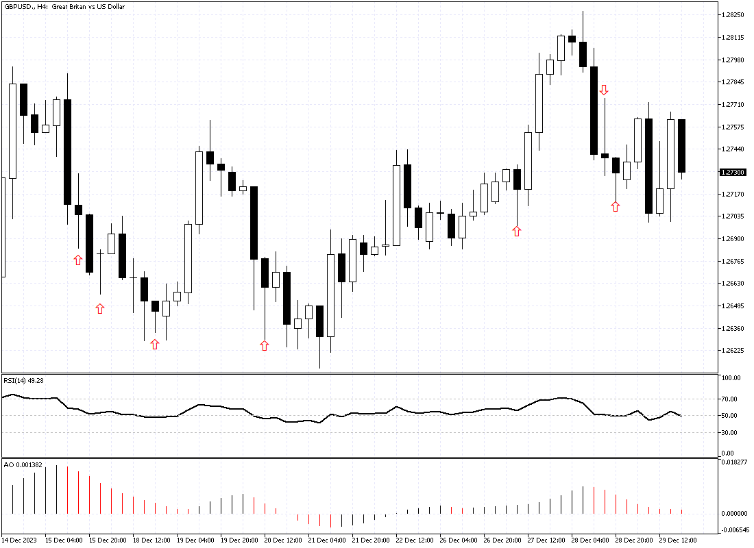
So, a candlestick with long wicks can be a valuable clue for us. It’s more telling in a downtrend than when the market moves sideways.
Trading with Long Wick Candlestick Patterns
Candlestick patterns with long wicks are helpful for forecasting when markets might turn around. These patterns, found on stock charts, show the difference between stocks’ opening and closing prices and the highest and lowest prices during that time.
When a candlestick has a long wick, it means there is a significant difference between the high or low price and the opening or closing price. This can be a vital sign that the market’s direction might change soon. Investors use this information to decide about buying or selling stocks, which helps them anticipate what the market will do next.
Understanding Long Upper Shadows in Stock Trading
When you see a candlestick with a long upper shadow when stock prices are generally going up, it might hint that this upward trend is starting to weaken. This kind of candlestick is like a warning for people who trade stocks. It suggests that it might be a good time to think about selling any stocks they bought with the expectation that prices would increase. Or it could be the right time to start planning to bet against the market, expecting that prices might start to fall soon.
This is because the long upper shadow shows that even though prices increased during the day, they couldn’t stay at those high levels. It’s a sign that the buyers are not as strong as they were, and the sellers are starting to take control.
Candlestick Patterns: Signaling the End of a Downward Trend
In a declining market, if you notice a candlestick with a long shadow at the bottom, it’s a hint that the downward trend might be losing steam. This kind of candlestick is crucial because it shows that even though prices went down, they didn’t stay down. By the end of the trading period, the prices had come back up quite a bit.
This movement can be a big deal for traders. It’s like a nudge, telling them to think about wrapping up any trades where they bet on prices falling. Or, it might be the right time to start getting ready to bet on prices going up instead. This change in the market’s mood is something bright traders watch for to make better decisions.
It’s crucial to remember that these patterns are not infallible and should be used in combination with other indicators and strategies for more accurate predictions.
Examples of Long Wick Candlestick Patterns
Let’s delve into some examples: XAUUSD Long Wick Candle: The Gold daily time frame chart displays long candle wicks before a reversal in price movement.
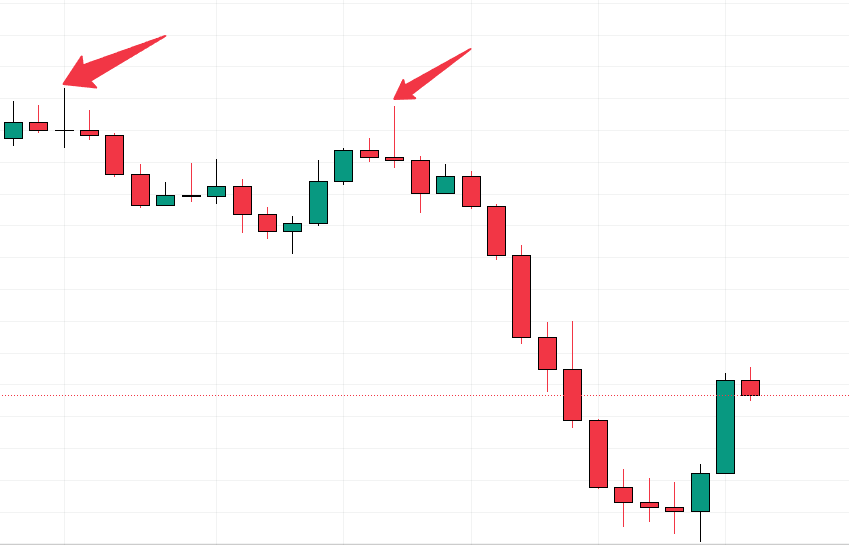
Please read this technical analysis that is based on the candlestick pattern. A real trading example can always help to understand the concept better.
Final Words
You can’t just look at the long-wick candlestick patterns alone. They make more sense when you see them in the big picture. This means looking at what’s been happening in the whole market. It would be best to look at trading volume, which is how much is bought and sold. Plus, other tools in technical analysis help, too. They all come together to give you a clearer idea of what might happen next in the market.